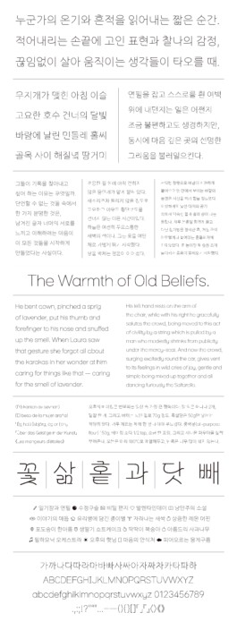
"서로"는 손글씨에서 생기는 유기적인 흘림 구조를 정돈한 활자체이다. 인간적인 곡선을 가지면서, 중심이 되는 획들은 올곧은 직선을 유지하고 있어 차분하고 단단하다. 사람들이 서로의 생각을 글로 옮길 때 편히 사용할 수 있도록 다양한 내용, 용도의 글과 어울리게끔 디자인했다. ‘서로’는 상호적으로 휘어지고 이어지는 획들, 그리고 글자 너머 누군가를 느끼고자 하는 사람들 사이의 관계를 의미한다.
"Seoro" is a typeface that refines the organic flow found in handwritten script. While it carries humanistic curves, its main strokes remain upright and straight, giving the type a calm and grounded presence. It was designed to harmonize with various types of content and writing purposes, making it easy and comfortable for people to use when expressing their thoughts in writing. The name reflects both the interwoven, reciprocal strokes of the letters and the relationships between people who seek to sense someone beyond the words.